 The above observation was essentially a study in the use of colours, of which should not normally work together, to suggest and manipulate the negative space into 'filling' in the form of the figure, whilst the actual line work suggests the tonal areas. I think this is quite successful, and is relatively free from the restrictive formula of trying to make it proportionately accuruate.
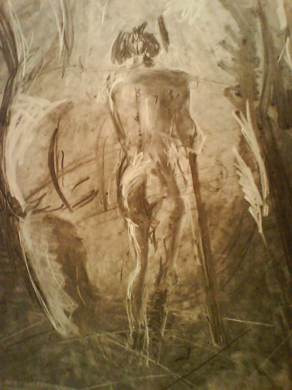
 Above and below were observations of the human figure in motion using charcoal. The latter required me to smear the page so as to break up the white, though admittedly I don't think it does much for the illustration here.
On my second attempt I thought more carefully about the tonal value of the model, and the chair on which she was upon. I started by smearing the page once more and then working back into it with white chalk. By constantly pushing backwards and forwards you can really create these nice tonal shifts throughout the body.

On another attempt I took this even further and decided to flip it around. I covered the page in black, using charcoal, and then had the task of only picking out the highlights on the figure. In some parts I think I am quite successful, but here I fall into the comfortable trap of making several lines to suggest the form, rather than trusting in the tonal value.


I really love these illustrations, as I think I manged to nail the mood and tonal form of the figure, and the environment she was in. In all cases I have manged to balance the use of smooth texturing, by smearing the background and working back ontop of it, and harsh linework, such as the thick black lines, and then the use of white chalk to push back the tone and create this nice highlights.


On the final observation I really wanted to tackle the use of perspective, at its most extreme, whilst applying this method of shading. Here I was forced to consider the proportion of the figure, but then rely on the fact I CANNOT HIDE BEHIND MY LOOSE LINES.

My favourite area is the foot, as here I literally added very little mid tone and only put down the extremities of black and white. This works suprisingly well, when looking at the rest of the image that allows for more subtle tones throughout. It makes the foot the focal point and instantly draws the eye.
No comments:
Post a Comment