Friday 23 April 2010

I really wanted to take this study of the orb one step further, and this ongoing visualisation project had really transformed into something beyond my intitial objective : Line work and the human figure. So for this experiment I wanted to take photographs of the marble under conditioned lighting. I set up the orb and my lamp and began to take several photographs as the lamp moved around, shifting the light source and the movement of the shadows.


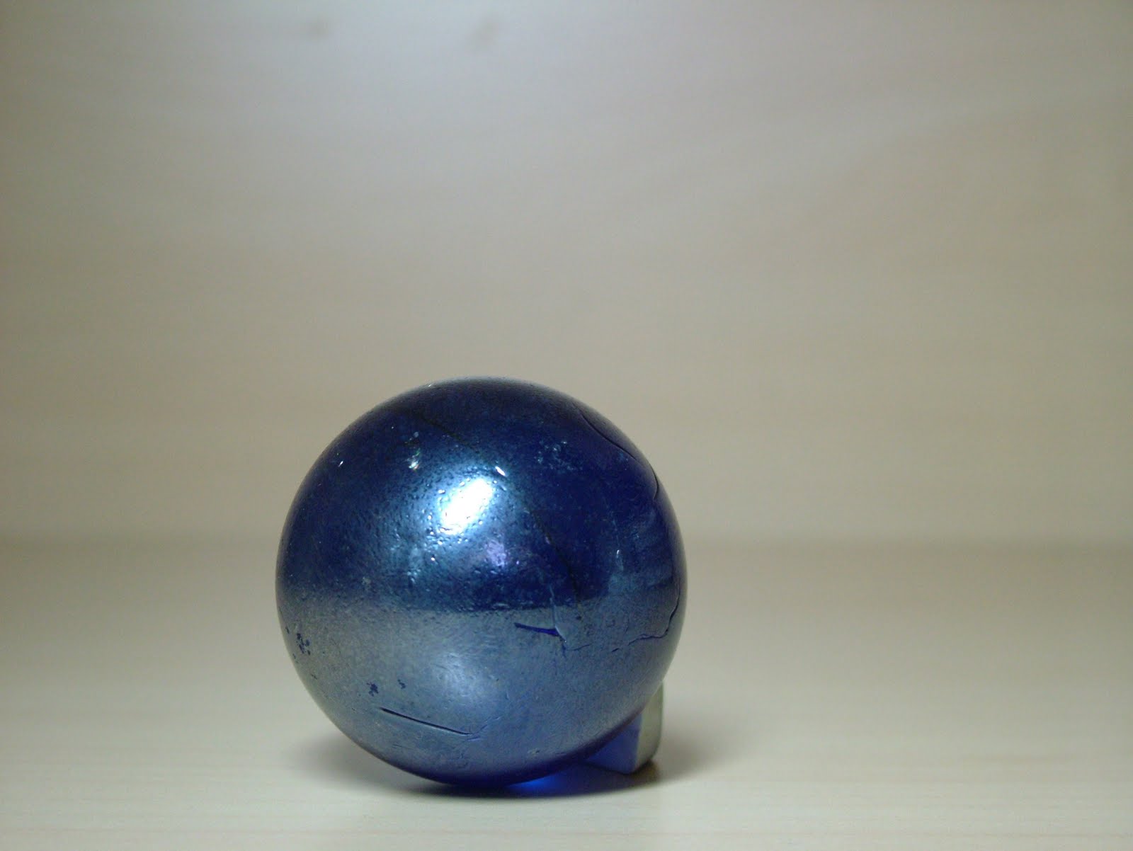
In responce I went back to collaging and, once again, went down the simplistic route. I collaged the basic shades and tones in a crude manner and began to make a collage for each picture.


My intentions were that you could see the basic light source and highlight move around the collage, imitating in a crude manner the movement shown in the photos.


Its at this point the light begins to shift around and the shadow creeps up on the left. Also I gradually made both the dark and light blue highlight on the right side smaller and smaller form this point.


After completing each collage I decided to put the experiment to the test and made a short animation of each of the consecutive images.


Although, like all the previous ones, this is by no means a skillful piece of animation, I do think it goes someway to understanding the movement of light and shadow. The only true flaw in this is the fact the simplistic collage needs many more layers to really get across the subtle changes in tone and the nuances of light that reality gives us. To collage that would, frankly, be impossible.

Orbs!


Some of my biggest influences are artists such as Shaun Tan and M.c Escher. Their pencil work has always been a source of admiration for me, and the reason being is they seem to make their illustrations transcend being 'just a pencil drawing'. They have real depth to their works, and it sometimes leaves you questioning how they made their works, if it wasn't specifically specified as the use of graphite sticks/pencils or any manner of drawing tool.


Here I did some of my own takes on escher's works, and found one of my dad's old marbles. Below I used two types of techniques to create texture and tone. The one below follows the Shaun tan-esque route, and I used a graphite stick to gently and subtley make dark tonal areas, always shading in circular motions to suit the spherical object.
Below was a different approach, this time using cross hatching. This method sacrifices detail, its its broad technique, but instead creates harsh tonal areas that are quite distinguishable.


I returned to my magic markers for this sketch, and even added a slightly metalic blue colour to give it some measure of depth. Essentially this thumbnail takes form with the use of the dark grey, whilst the white negative space creates the 'highlights'. Everything else is just shaded linework or heavily rendered tone.


These are the photographs I took of my dad's marble for reference. I also took each of these at a different type of day, from a different angle of the light. This has created some suprising differences to the depth and colour of the orb.


I became quite fascinated by the many layers one item can yeild depending on the light and I decided to delve into some digital painting, using the program Coral Painter 10. I started to make 'thumbnails' but solely using colour and paint, abiet digitally, to study each varying depth the orb shows in the photographs.


To make these I applied both guache paint and 'Artist's Oils' settings and began to lay down the foundations of the tone. I selected various hues of dark blue underneath before working into it with light blue colours and metallic shades. Afterwards I applied the pallete knife affect and began to smudge the paint around, creating this smooth and almost liquid texture.


The image below follows the same principles of the above but due to the high amounts of highlights, this required a little more detail. Instead of just smudging I later applied the highlights after in digital Oil paint, I then used photoshop to blur these highlights so they didnt seem as liquid, but didn't clash with the overall smooth quality of the orb.


This photograph is my favourite as the orbs seems to be more than just a sphere. It seems to have a depth to it inside, that colour couldn't event capture. Never the less I endevoured to capture this depth, similar to one of my previous thumbnails, and began to have fun painting the skin tone against the deep blue of the orb.


I followed the same technique as the previous but this time I set myself the challenge of putting the artificial 'dry' mode on the paint settings. What this means was the paint, digitally, is on a timer and dries out over time unless you manipulate it. This meant I had to just be bold and not play safe, placing the colours thick and fast and then quickly manipulating it with the pallete knife before it dried out. You get some nice differences in smudging in this picture. Some of the colours readily smudge and create some great depth ( particularly in the orb ) whereas where I neglected the paint, such as on the back fingers, my digital pallete knife only seemed to scrape the paint. This created that strange blurring outlining the back fingers.

Collage was also a useful method in capturing the many layered tones of the sphere and I applied the same formula, though I didn't wan't to get bogged down in the detail. Again, as with my previous collages, my concern was merely getting across the general picture. I quite like how the varied tones come together and imitate nicely the depth of the marble.

After another hiatus I found myself being stuck in my room, and decided to use that. I took a few pictures of my window area and my stairs, and lowered the contrast to really make that tonal range quite broad.

Below I made a collage that is meant to represent the many tones found within the image, even if the colour or depth is not correct. I wanted this to be particularly abstract, or quirky and I was especially inspired by Pablo Picasso's cubism for these.

Again I used the text to my advantage and them accentuating the lines and contours of the image. Also I completely ignored proportion and rather went with just trying to capture the 'feel' of the room.


This one is the most bizzare and personally is the biggest departure from the original photograph. Here I decided to add tones that are not necessarily in the photo but to try and intergrate them in some logical manner. Here the stairs are reduced to a mere suggestion, the door mostly negative space and the banister is some obscure dark shape that draws the eye towards the centire of the picture.


This collage is my favourite as it has the most layers to it, being very weird whilt still, even more weirdly, retaining its essence with each of the forms being quite obvious.


Detour

Due to various issues at home, my project and drawing began to suffer heavily. After a several weeks hiatus I returned, without much enthusiasm. These studies were more a means to divert my focus away from the issue, rather than thinking how this fits in with the project, but non the less these were studies in light and shadow.


To create these I used various shades of pastels, ranging from white to black. I used many techniques to create the many layers,even using masking tape and then smearing the pastel along to get at the tough areas. Above the smudging effect is most prominent and really makes the whole thing appear very smooth and multi-layered, whereas the picture below was more the use of linework again. This reminded me of its merits and why, even with tone, you don't have to abandon that kind of mark making entirely.

Here I tried a different tact. I used water colour this time and used the natural colour of the pinecone to give it some depth. I also went a step further and even made a slight pop up element to the image, where the pinecone literally springs out from the page. This casts a natural shadow over the flat paper, and enhances the forced tonal shading.


Tonal Value

After reviewing my previous work I realised that more and more I needed to discard my lines. I was hiding behind them too much, and most likely they were concealing the true flaws in my work. I began to have some serious fun by pushing away from lines and relying solely on the study of tone.

I revisited my previous thumbnails and decided to create very crude collages, and repeat the same basic animation.


Essentially my thoughts were to not worry about proportion, or even making each piece look like a hand, or foot or any part of the body. My goal was to merely suggest the tone and to try, loosely, to make these thumbnails have some form and three dimentionality to them.


Some of my favourite parts of these collages are the use of the text, taken from magazines. Like linework, you can manipulte the direction of the text to suggest and streamline the shapes and contours of the body. Your eye naturally follows the direction of the text, which therefore means you read the posture correctly.


Below is my favourite collage as this was inspired by another student's lifedrawing observation where they only used black and cream paint. The tonal shift from the upper arm to the elbow onwards was so simple yet so effective. So I followed the same idea here and you can see, on the nearest arm, I literally use two shades to suggest the bend of the arm.


Again, like the previous test, I re-scanned these images and pieced them together. I think the tonal work doesn't detract from the movement, it only enhances it and makes you read the action even more. It is here we can see another principle of animation being ancouraged by the use of mere suggestive tone.

Suggestive tone

After coming to this realisation I decided to change my approach a little. I signed up for a lifedrawing course at my old college, once a week, and used my sessions towards this visualisation project. I was forced to use varied items such as charcoal, oil paint, pastel, chalk, and even manipulate the paper I was drawing on.

The above observation was essentially a study in the use of colours, of which should not normally work together, to suggest and manipulate the negative space into 'filling' in the form of the figure, whilst the actual line work suggests the tonal areas. I think this is quite successful, and is relatively free from the restrictive formula of trying to make it proportionately accuruate.


Above and below were observations of the human figure in motion using charcoal. The latter required me to smear the page so as to break up the white, though admittedly I don't think it does much for the illustration here.


On my second attempt I thought more carefully about the tonal value of the model, and the chair on which she was upon. I started by smearing the page once more and then working back into it with white chalk. By constantly pushing backwards and forwards you can really create these nice tonal shifts throughout the body.


On another attempt I took this even further and decided to flip it around. I covered the page in black, using charcoal, and then had the task of only picking out the highlights on the figure. In some parts I think I am quite successful, but here I fall into the comfortable trap of making several lines to suggest the form, rather than trusting in the tonal value.


I really love these illustrations, as I think I manged to nail the mood and tonal form of the figure, and the environment she was in. In all cases I have manged to balance the use of smooth texturing, by smearing the background and working back ontop of it, and harsh linework, such as the thick black lines, and then the use of white chalk to push back the tone and create this nice highlights.


On the final observation I really wanted to tackle the use of perspective, at its most extreme, whilst applying this method of shading. Here I was forced to consider the proportion of the figure, but then rely on the fact I CANNOT HIDE BEHIND MY LOOSE LINES.


My favourite area is the foot, as here I literally added very little mid tone and only put down the extremities of black and white. This works suprisingly well, when looking at the rest of the image that allows for more subtle tones throughout. It makes the foot the focal point and instantly draws the eye.