Monday, 12 July 2010

Narrative

During the narrative retrieval session, we discussed the fundamentals of story telling, broken down into various beats that create the recipe for a well structured narrative, though this does not necessarily guarantee a good and compelling story. This is merely the foundations, before creativity and originality come into play.

Below are some of the scans of my notes, breaking down the main beats of a story, and what they mean.
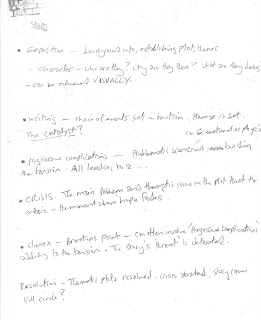
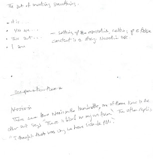


As a series of experiments, multiple stories had to be created using the main narrative beats, starting with the setting, the scenario, the progressive complications until finally the resolution.
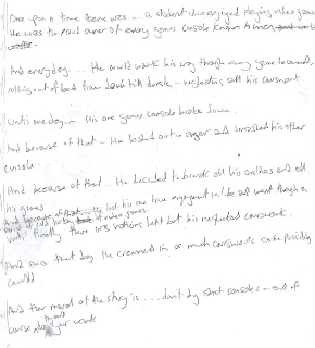


Other examples can be found below:

Once upon a time...there was a dog, a great big hairy dog who sat on his own in the middle of a front yard, watching cars and pedestrians zoom and amble by.
And every day...the dog would run round and round in circles, chasing his tail from dusk till dawn.
Until one day...the dog’s tail fell off.
And because of that...the dog decided to bury his tail.
And because of that...the dog became complacent and slept from dusk till dawn on the front yard.
And because of that...the dog became increasingly lazy with each passing day and forgot how to run in circles.
Until finally...the dog missed his tail so much that he forced himself to carry on running round and round in circles, hoping in vain to catch his non-existent tail. Eventually he ran round so much, he dug himself into the ground and unearthed his lost tail.
And since that day...the dog was reunited with his lost tail and decided only to run round in circles once per day, and resting sensibly.
And the moral of that story is...don’t lose your tail(?)


Once upon a time...there was a jockey who wasn’t very good at taming his new horse.
And every day...he would try and try and try to mount up onto the saddle, failing miserably each time as the wild steed would reject him.
Until one day...the jockey had an idea. He decided to tie the horses legs together, so it was unable to kick.
And because of that... the jockey attempted to mount up again, only to be thrown off by an increasingly frustrated horse.
And because of that... the jockey had another idea. He decided to tie the horses head down, to ensure it couldn't rear and buck.
And because of that... the jockey attempted to mount up once more, only to be thrown off again by a now livid horse.
Until finally... the jockey untied the horse's head and legs, and apologised profusely. The horse, in repayment, demanded that the jockey act as his steed forever after.
And since that day... the jockey has labouriously carried his steed on his back till the end of his days.
And the moral of that story is... try asking nicely.


Typical examples of how you can create scenarios using that structure. There are certain elements within these little narratives that are crucially important in setting the scene, and fully realising a scenario and the characters within it. Elements such as describing the student as the PROUD owner of games console, a GREAT BIG HAIRY dog or a LIVID horse. Immediately this speaks volumes as to the nature of the characters, and perhaps their motives, lending themselves to the progressive complications. If somebody is proud of something, then you know a complication would arise where their pride would be wounded or taken away from them etc- the character then compliments the narrative. The same too can be said of how the progressive complications can lend themselves to the inevitable outcome, and how as a writer you can use your instincts to play on that inevitability and twist it.
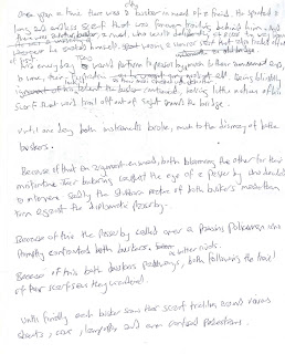
The progressive complications can also be fiddled with, and introduced at various intervals, heightening the tension, and even adjusting the three act structure from the norm, something shakespear was fond of doing and experimented heavily with.

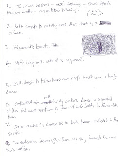
Above is one of the stories I selected, based around two like minded individuals who start off as rivals but eventually put aside their differences. It was an unfinished story, one that I updated and refined below. This story has a nice abstract element to it, with the scarf serving as the visual metaphor for their connection, which at first remains unnoticed until their need to re-engage draws the scarf into the forefront.
Here are some examples of how film plots are written, and feature certain principles of narrative writing that can be applied here.
The above link goes on to talk about the three act structure, which I mentioned earlier, that essentially splits a story into a beggining middle and end. There is a useful list of fundemental elements that a story requires, and in truth every story should be able to tick each of them off.


http://www.dvoted.net/Knowledge/Articles/Film-pre-production/Some-synopsis-examples/


Below is an example of one of the synopsis entries in the above link:

''It’s Chicago in the 1920s. The Prohibititon is in effect, which makes the illegal market for hard liquor a profitable business to be in. It’s quickly taken over and controlled by the mob. On top of everything is the cold-hearted businessman and mob-leader, Al Capone. He is untouchable, but others are soon to be too.

Federal agent Elliot Ness is a newcomer at the Chicago Police Department, with the purpose of taking down Al Capone. He quickly realizes the extent of corruption among the crooked cops in the department and assembles a new team of mob-fighters, including the veteran patrolman, Jimmy Malone, who does not have a dishonest bone in his body. He introduces Ness to the Chicago underground and becomes his mentor and friend.

Al Capone pays no attention to the new enforcement, but when Ness and his team suddenly raid one of Capone's liquor warehouses and are named ”The Untouchables”, he gets pissed off. Now the real war begins. Ness has to bring his family to safety in another town. His newly arrived federal accountant is killed by Capone's prime hitman and so is his main witness, a captured gangster.

The effort seems meaningless at this point, but Malone finds the key to the puzzle, Capone's bookkeeper. Unfortunately Malone is killed before he can bring the bookkeeper in. This triggers Ness. He and the last member of his crew, George Stone, get hold of the bookkeeper and secure his witness statement in court, to bring Capone to face a 10 year sentence. Peace in Chicago is restored... for a while.''
The opening paragraph sets the tone, the era, and the backdrop. Its short, simple and already alludes to what is to follow. Chicago in the 1920's already speaks volumes, and the scenario is made clear by the backdrop, and more importantly, how a key character fits into all of this, described as a 'cold-hearted businessman'.
The next part introduces the protagonist, and how his mission sets up the plots series of progressive complications and inevitable conflicts- without a conflict there is no story. Also the sub-plot friendship of Ness and the veteran honest cop is mentioned in brief, setting up the dynamic that later plays out.
The following part reveals the bleakest moment in the story, where everything seems hopeless, and the conflict causes the protagonist and the antagonist to come to severe blows. The crucial part is where the raid makes Al capone 'get pissed off'- it highlights the emotional change in him, and how his retribution causes the protagonist to make a personal change to his life- moving his family to safety.
And then we move to the conclusion, the bleakest moment subsides when the answer reveals itself an the protagonist acts upon it in a last desperate attempt to beat his opponent, sentences such as 'This triggers Ness' are noteworthy, as it pinpoints the motivated drive of our main character which become key to his victory.
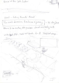
Below are some more of the notes I wrote, re-evaluating my busker's story. This time I wanted to try and nail some of the main beats, some of which I revised once the heart of the story became clear after speaking with my tutor and lookin for related existing stories.


Here is the revised (brief only) synopsis of the busker story, as was asked for:


''Two lonely scarf-clad buskers find themselves occupying the same space in a dishevelled underpass. At first they are rivals, and soon lose their ability to play their beloved music by breaking their instruments in a furious face-off. As they spiral into enemies, they both depart on their own, following their path laid before them by the endless ragged scarf trailing off. As they wander alone, they soon become entangled in their frustrations and desire to play music once more, only to find in their dance-like movement they have more in common than they first realised...''

Below are some useful links I found to do with storyboarding, and a little sample I picked out that describes good character introductions.

I really like how the Alfred Hitchcock break-down of his film 'Lifeboat' really demonstates the power of good character intros. Characters are the backbone to any story, and are the driving force of any story. So it is essential that when they first appear, everything about them should be made clear, even if it is revealed at a deliberately slow pace- i.e morally ambiguous characters, for example. Some of my all time favourite character introductions come from director sergio leone, famous for his wild west films.
Below are some videos I've pulled up that demonstrate the language of film at its best, with great composition of shots that introduce characters, setting and story. The first one is a famous animation made by Michael Dudock de wit called the 'Monk and the Fish'. After I explained my potential story idea to my tutor, he pointed me in the direction of this short animation, explaining the similarities of rivals finding they are more alike at the very end. Its a wonderfuly touching piece of storytelling, and clearly demonstrates the crux of my story I am trying to tell.


Reference Videos.


As I mentioned earlier, sergio leone is a huge influence on me and will effect how I will storyboard my story, focusing on emulating the classic mid-shots and close-ups that defined his woks. Below is a prime example of his wonderful casting, compostion and ability to weave tension right up to the moment of conflict.


Another classic film is Deliverance, again this particular scene was suggested to me after I tried to explain the scenario of a duel over music. The dueling banjo sequence from this film sums up the conflict perfectly.


When the scarf comes into play during the sequence of conflict/dance, I envisage it to appear similar to ribbon dancing, and this admittedly random video I found is a great visual explanation of what it is I want.


Beat Board.
With all my influences set, I went about mapping out the story into a few of the main beats. These are crude drawings, and composition and framing is NOT essential here. This is merely a means to capture the idea and soul of the story briefly, a visual synopsis to compliment the written one.


It seems pretty straightforward, and in truth the story is rather simplistic, however that is the beauty of it. A simple story can be enriched by interesting framing, and compelling storytelling interwoven into the plot. Above and below I have tried to capture the main beats, where the story shifts in another direction at key points. The duel playing, the breaking, the argument, the parting of ways, the entanglment, the realisation of the link, the dance-like union.
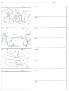
There are certain other elements for the storyboard that now need to be applied. I have to consider not only how the main beats punctuate this story, but also how my frame composition compliments the soul of the story, and adds to the momentum of the plot.
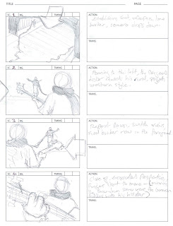
Storyboarding.


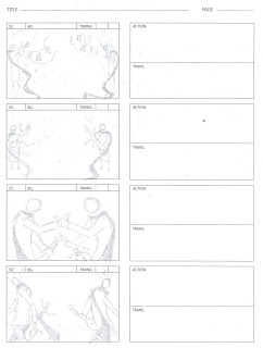
The first page has the opening establishing shot, the underpass setting the grimy tone which immediately reflects the dejected and solemn mood of the buskers. One of my favourite shots is when the camera pans to the side, so the framing of the one character at the foreground slowly reveals the second character in the background, adding to the drama.
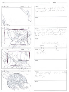

With the second sheet I directly borrowed some of leone's classic close ups, using the perspective angle and repeated cuts backwards and forwards, zooming in bit by bit as the face off reaches its peak. Also the dynamic of flitting between extreme close-ups and wide-shots is also very effective. It simultaneously keeps the audience aware of the space and environment, whilst immediately thrusting you intimately into the action.
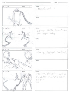

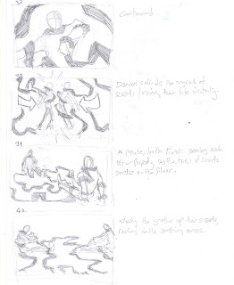
Symmetry plays an important role in this storyboard, as both buskers in their rivalry mirror each other in almost everyway. This is enforced by the scene where both stride across the underpass toward each other agressively. The following scene shows their clash, and again is a close-up, making the drama intimate. The final scene introduces a third party, seen strolling in the background. My composition was crucial here as I needed to shift the focus away from the argument (which at the moment is an eye-catching scenario) and I employed an age-old visual plot device of using the environment or objects, in this case the scarf, as a physical element that draws the eye towards a new focul point, not to mention pushing the bickering pair to the right so as to give wide space to the left for the eye to naturally sweep over at first glance. Very effective.


Here body language becomes key in the absence of dialogue. The third man turns out to be a policeman, made clear by his iconic bobby helmet, and quite literally splits the pair apart, wedging himself inbetween, enforced by his positioning in the center of the frame. With clear character posing, the outstretched hand of the policemen, the slouched demeanour of the exiting buskers and last shot of the pair walking away from each other all do their part to cleary and effectively tell this part of the story.
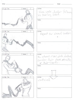
Now dejected, the pair follow their scarf. Here body language works in my favour once again, with each step their frustration becomes more apparent as they grapple with the scarf.
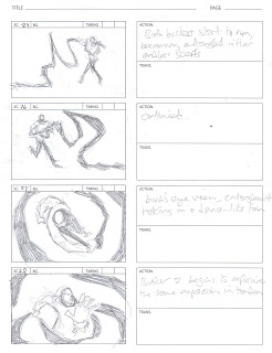


Its here that the story turns into its dance-like form, with the scarf literally taking a life of its own. Overhead shots are useful here as the framing allows the scarf to ribbon around the shot, creating a swirling motion.
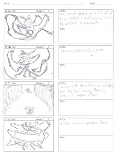


There are often alot of films that blur the action with close-up after close-up, which makes the entire sequence very unreadable- a pet hate of mine, despite how visceral the experience can still end up being, so with the dancing I actually made the composition relatively mundane, and made it so the action in the frame is readable, coherent and speaks for itself. The camera work doesn't need to do much else here.
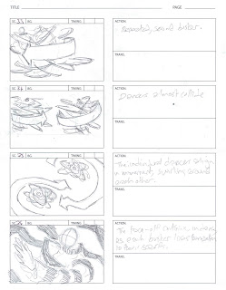

Once again I apply the overhead shots where needed, the pattern and movement of the swirling myriad of scarf can be quite beautiful, and really enforces the dance aspect to this sequence.


In the above sheet (I ran out of storyboard paper so continued on plain) the dance reaches its peak and subsides as they collide. There are two things that were important in this sequence. Firstly the 'aftermath' of their collision needs to force both parties to face each other during the silence, again continuing the miroring symmetry, and secondly to show the scarf now lifeless and bereft of movement as it snakes along the ground which symbolises the end of the dance.
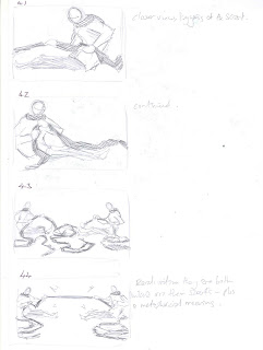


The moment the pair realise their scarfs are not individual but are infact one and the same, that physical link is the defining moment of the entire story. And, usually, such key moments are given a wide birth in their framing for the image to engrave itself in people's minds.
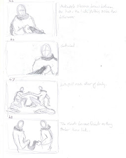


Simple cuts from close ups to wide shots add to the drama as the pair draw closer and closer until in the last frame they are stood opposite each other, both looking down at the one physical link between the two before they burst into dance, this time in union. Again for the action to be readable, the framing is relatively mundane here as the energy within the four walls is enough to keep you occupied.


Rejected sequence.
In making the storyboard there were alot of scenes that I pondered over, and ultimatly cut out due to them adding very little to the main drive of the story.


These were ome rejected sequences where the pair actually used their scarfs against each other during the face off/dance in tug-of-war fashion. Ultimately I streamlined the story and cut these from it because I felt the energy of the story only lasted as long the conflict did, as soon as they become friends then the ending has been achieved-anything else after is fluff and merely stalling the inevitable ending.


Feedback;
After showing the storyboard to a few of my family members, who were not aware of the elements that go into narrative works but rather judge on face value, the feedback was very positive. To them the action was very readable, in particular the body language of the characters, however some pointed out the background could have been established more, and that the policeman felt a little contrived- all fair points. There was also some minor confusion as to which character was which when switching between scenes, something I tried to address by having each character positioned opposite to each other as the sequence flowed. Character expressions was also asked for, however I am a firm believer that facial expressions are the easy route to go down, and in truth its body language that communicates the most- which Is why I deliberately left the faces as blank and focused on teling the story through line of action poses, though of course if this was to be made into a film or animation, then the facial expressions would compliment the body movement. I think the fact most of my family could still tell and feel how the characters were feeling without the aid of facial expressions shows that my poses seem to have done the job effectively.
Evaluation.
Storytelling requires a few fundamental principles and guidelines to follow, examples include the three act structure or/and the main beats as displayed above. However, GOOD storytelling requires you to not only understand these principles, but to alter them, twist them and add imagination using your writing instincts. In essence, to bend the rules you first have to know them. I'm certainly in no position to be bending rules as of yet, but I think my understanding of the basic foundation blocks is sufficient enough for me to begin that process of being comfortable in narrative structuring, and knowing how and when to bend the rules in future to create something compelling. Its amazing to see how often these principles are so often overlooked in modern day storytelling, in any format, and I think the future of comic books, storyboarding, animation and filmmakingin general lies in looking to the past at the old pioneers, such as Hitchcock, Leone, Disney, Kirby etc.
My favourite aspects of this micro project was picking apart existing synopsis, and showing my storyboard work to other people and seeing how they did or didn't read the action. With the synopsis break down it was very important to understand how it was written and to lay it bare before your eyes, in a way akin to taking a puzzle and breaking it up only to discover how to put it back together again. With the storyboard feedback the constructive criticism was enlightening, and refreshing. From their perspective you really gain an understanding of how much you have or havn't learnt the principles and whether you can utilise them effectively. I would certainly like to look into cinematography and script-writing in future which will both help me in my storyboarding specialisation, and pre-production in general. I am still very much in the dark about technical names for various camera angles and shots, and although I seem them all in my mind, its still difficult for me to communicate what it is I want.
In future I hope to become more confident in my storytelling and start to map out various ways of playing around with the rules, and in other places sticking to them where necessary, in order to create a compelling and original piece of narrative. On a side note, this storyboard and beat board process highlights the need for you to understand the crux of your story instantly, because if you have any doubts as to the main 'moral' of the tale, then it shows in your work as it becomes too muddled and incoherent. Also having a firm knowledge of body language, via line of action and extensive life-drawing is also essential here, at least for me.
Overall this is the first step with getting to grips with the basics, and adds a whole new layer of appreciation to the great storytellers, plus this project can act as a wonderful source of reference for myself in the coming days to remind and refresh myself of the principes if and when my mind goes off track.

Thursday, 17 June 2010

Business of Animation

Pre-production, in filmmaking and animation, refers to the design process that begins with the initial concept or idea that becomes moulded into a pitch, beat boards, first treatment, final script, storyboarding, character design, set design, animatics etc- right the way through to the moment where ‘production’ begins, this being the actual animating or filming. In the pre-production pipe-line alone there are a vast number of factors to take into consideration, with an equally as large amount of specific job elements one can find themselves specialising in. This stage of the process is the most important, and acts as the backbone throughout to the very end of post-production. Without a script, there can be no story to animate and film, without a storyboard there can be no visual narrative, without any character designers there can be no characters. Specialising in any one of these aspects requires an over-all universal understanding of filmmaking and the language of film. A storyboard artist needs to understand how to frame scenes, and may often be dictated by the director, which all aids in the practicality of shooting on sets, and the restrictions that come from the set designing can dictate how the shot is framed- the list of cross pollination in each of these specialised areas is endless. Team-work is essential, even at this early stage.

http://indieauteur.com/2009/08/25/film-pipeline-overview-pt-1-preproduction/


Due to the nature of designing and producing films and animations, pre-production artists tend to remain relatively incognito as opposed to , for example, the directors and cinematographers who gain widespread recognition for their work. However, there are certain sought after designers who often find themselves circulating around the industry working on various projects. One of the latest stop motion animation films to come out, in itself a wonderful departure from the pure CGI trend, called The Fantastic Mr Fox. I found an interesting interview with the storyboarder who discussed his approach to designing the sequences in relation to the restrictions of stop motion animation.


http://drawn.ca/2009/11/09/an-interview-with-fantastic-mr-fox-storyboard-artist-christian-devita/


Its quite evident that the director’s preference in composing shots and art style was clearly the dominating factor in how Christian went about storyboarding the script. There were quite some detailed aspects to the interview that intrigued me too such as:


‘’It was complex to adapt to Wes’s style initially, as doing storyboards you’re always looking for interesting angles, nice positions to place the camera and cutting back and forth between characters to get a narrative going, so the first thing was to get accustomed to playing long shots in one camera position.
I think I adapted quickly to the style and I worked closely with Wes so I got first hand direction from him any time needed.’’


I love how his own style clashed with the director’s and he had to alter his mindset in order to accommodate, which would have been an amazing learning curve for him. This shows how important the relationship between a storyboard artist and a director must be in order to successfully realize the narrative visually.


‘’I was heavily involved in the animatic production. There was a small team working solely with Wes in Paris which included myself, 2-3 editors who cut all the storyboard panels together with sound and Jeremy Dawson, one of the producers and long time collaborator of Wes. I spent about a year working in different hotel rooms and apartments in Paris, taking direction from Wes and drawing like a demon so that the editors could take my drawings and work their magic. As I come from a traditional 2D background I drew the panels as I would a 2D animation, and had my notes for the editors regarding animation timing, but Wes was involved throughout timing the whole thing, from length of shots to timing of actions, and even sound. He was very hands on.’’


This offers a wonderful insight as to how Christian’s traditional background had its advantages and disadvantages during the pre-production process. On the one hand his knowledge of 2d drawing, and his teamworking with the editors meant that they could pool their ideas and experiences together to help make the animatic, however the downside to this could have been that his traditional style of drawing, and having to scan in could have been very time consuming, something that could have been avoided if, for example, he had been trained in photoshop and other digital drawing programs that could be manipulated instantly. Perhaps with the filmmaker’s desire to become more streamlined, that is where it may go, but then his traditional knowledge and background clearly proved invaluable on a stop motion production such as this. Another thing that intrigued me was to learn of his heavy involvement with the animatic, something that I assumed was logical but never actually found proof of it happening, until now!


Going backwards in time slightly, a prominent storyboard artist named David Russell was famed for his concept work on films such as Batman, Terminator 2 right up to modern day productions such as X-men Wolverine, and even the new Chronicles of Narnia film. In contrast to Christian’s adherence to the director’s vision, David speaks of how some storyboard artists become their own directors:

http://www.storyboardart.com/media.php

"Some directors know from the outset exactly how they want their film to look," says Russell. "For these "Some directors know from the outset exactly how they want their film to look," says Russell. "For these individuals, the storyboard artist simply realises on paper their ideas for shots. Others, however, set out only rough guidelines, and give the storyboard artist more creative freedom. The storyboard artist then must rise to the task of essentially directing on paper"iduals, the storyboard artist simply realises on paper their ideas for shots. Others, however, set out only rough guidelines, and give the storyboard artist more creative freedom. The storyboard artist then must rise to the task of essentially directing on paper"


This again enforces the idea of having to have a sound understanding of how the entire language of film works, because it would seem some storyboarders have the ability to direct the imagery for themselves, and push it even into the animatic stage, or they can be dictated and adhere to the director’s specific style who may have their own artistic flair. Either way, it would seem all illustrators in the film industry have to be adaptable and prepared for any kind of change in their work style.


There are constant changes and adaptations in the pipe-line, often caused by a new need in filmmaking that the current methods cannot cater for. One early example was during the making of attack of the clones. When the design team set about making the animatic for their battle sequence, they quickly realised that utilising CGI to loosely bulk out the entire flow was needed, rather than to animate using 2d as was often the norm.


CGI animatics have since become frequently used, alongside the still existing 2d method, to make these storyboards come to life, helping with managing sweeping shots and odd angles that couldn’t truly be communicated as effectively with drawings. This also adds an entirely new fluid way of editing too, something not normally taken into consideration at quite the same level so early on in the process.


During Pixar’s production process of making The Incredibles. This film dates back to 2000 in production and director Brad Bird found that his ability to communicate to his team became hampered due to his drawing edits over roughs but being unable to apply that digitally. A new software was specifically developed for this new method of the director communicating with his team which enabled him to digitally draw edits directly onto the works of his collegues so they could visually understand what he was trying to get across. Also an interesting quote from the above article describes how much of an improvement story reels went through:

http://www.adaptivepath.com/blog/2008/07/14/conversation-with-michael-b-johnson-of-pixar-part-1/

‘’The Incredibles really set a new bar for the effectiveness of story reels. I think that had to do with particular leadership in place on that film – director Brad Bird, head of story Mark Andrews and director of photography Andy Jimenez.’’


This clearly shows that the combined effort of the team, pooling their ideas together, is the key to how they succeed in progressing the art of fine tuning many of the elements of pre-production. Their story reels were edited and drawn to an impressively high standard, showcasing their enthusiasm to do the best job they can and also how collectively the mindset of creative people can produce bar-raising works.


http://digitalcontentproducer.com/dcc/revfeat/video_tool_time_pixar/


As the article describes, this new technology has now been employed by all the pixar team, and has been used subsequently in all of their productions to date. This is a clear example of how visual communication at the very heart of the pre-production aspect played such a pivotal role in their work-force that they actually catered for it by adapting their existing technology and methods.

“Brad's always giving a pen to someone and saying, ‘Well, draw it,’” says Johnson.

Another example in the development of pre-production is the hiring of talent that is OUTISDE of their normal industry, for example rather than roping in a specific storyboard artist, the Iron Man 2 production team decided to employ a well known animator and illustrator.


http://www.ugo.com/movies/genndy-tartakovsky-storyboarding-iron-man-2


This speaks volumes to me as to where the industry could very well be heading with such methods, pooling ideas from outside and unusual sources to lend their imagination and flare to proceedings. Iron Man 2’s actions scenes certainly gain a much needed boost and zing to the imagery and sequences, especially to the composition and framing. I would imagine the future of pre-production is essentially to be pushed into being as streamlined as possible, for economic reasons and also for creative satisfaction, knowing that ideas and concepts can be better realised, especially when its quite clear being able to communicate any theme and concept visually is the key to a successful piece of filmmaking. As camera angles become more ambitious, so too will the storyboard art have to evolve, most likely merging with the story reel/animatics using modern technology.


Over the course of the year I have taken part in several briefs, live and module ones, with the focus upon my pre-production knowledge, more often than not I have found myself as either the character designers or storyboard artist, often both and even on the rare occasion as the maker of the animatic. During the Rountrees group project my main emphasis became the character designer, whilst another took on the role of storyboarding. It was a very useful experience to be put outside my normal area of practice and actually have to work with someone else’s ideas and imaginations about composition and framing. The most rewarding parts were the times where he and I would sit down with our sketchbooks and compare ideas, discuss concepts and inspire each other in our own area. His suggestions for some of the camera angles and dynamics of the shots did actually have an influence on how I created the characters, and vice versa.


In another group project, a live brief this time, I once again became the character designer however I was given much more freedom with my group as they encouraged me to draft up the storyboard too. As we were designing it became increasingly apparent that I needed to talk to my entire group for every shot, in particular a moment where I had envisaged a wide panning shot revealing many signs and posters all across a street. I had to sit down with one of my group members who were in charge of creating the banners and the street layout and discuss what exactly would be shown and how much there would need to be done.


On the narrative brief this required me to work alone and to apply my skills in visually telling the story via the scene boards using body language, in this case I had much more freedom to act and decide at my own will and the story featured predominately the characters with next to no backgrounds, however I do wonder how the storyboard may have turned out had I been in a group. In particular the most satisfying aspect of that brief was turning the written word into images, knowing how to send the same message in a totally different medium. Drawing inspiration from outside sources was also key, such as cinematography and defining trademark camera work from certain directors- but rather than shoe horning them into the storyboard for the sake of an homage, I had to understand the intent behind the shot in order to place it in my own story logically so it ensured the narrative was being served.


For my own understanding of pre-production, and in particular the storyboarding aspect, I’ve realised that you need to understand how production and post-production works. Having that awareness of the entire pipe-line ensures you know exactly where you stand within that, and what it is you have to achieve. To storyboard you need to be a cinematographer, on some levels, and also an editor and mini director, however your work can only function with the guidance of the aforementioned creative minds, a blend of team work and your own self-suficiency then. A sound understanding of movement, lifedrawing, perspective and ‘energy’ in your images are also needed to compliment the script. These are the basic skills, however in light of the changing environment around pre-production, I would imagine learning to use such programs as photoshop, coral painter and illustrator are useful mediums to employ, all helping to streamline your abilities. The more streamlined the process goes, the more money is saved on the budget. So wherever technology can aid that, that is where artists and creative minds alike will find themselves having to adapt to. It could well be less people are used in the design teams, due to streamlined methods cutting out alot of the middle-men, and so each member would have more than one skill? Perhaps a storyboarder could also be a proficient editor- having a knowledge of both enhances your abilities in both section etc. For me, I think the best bet is to gain a broader understanding of the entire pipe-line, and to pick up skills that compliment each stage. That way, when I come to storyboard I have the foreknowledge of how this certain frame or scene is going to be shot, and my pre-emption and make some creative choices early on before certain bumps come and disrupt the flow of production. The wider your knowledge in a broader field, the better you can narrow your skill to compliment one small aspect.

Monday, 14 June 2010

Concepts

This diagram illustrates the development of CGI production in or around the making of a film/video output. The same pipeline applies to any form, be it full CG animation, or merely adding special effects to live action footage, e.g Avatar.


This process can also interlink with each other, and backtrack where needed. Each stage is connected by solid communication from each department, and they all rely on each other to ensure the production process runs smoothly.

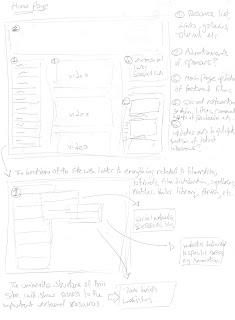
Online Space business plan.

My idea would be to create an umbrella webspace that pulls in underground artists in both animation, gaming and filmmaking, utilising existing social networking sites and external websites dedicated to each medium, offering forums, review sections, a free space to post independent films, and a place for sponsers and mainstream representatives to turn to when roping in some of the ideology and methodology of 'underground' filmmaking.


Strategy;
In the current age of online communication and distribution of media amongst certain communities, this has offered an entire range of perks and bonuses to those wishing to find access into the wide industry that caters for it. Various ‘indie’ or underground productions have found fan bases and lives of their own via the online medium. There are downsides however, and prejudices to the underground filmmaking that mainstream features often

If an online space were to be created to cater for the needs of up and coming filmmakers, animators and games designers, then there are certain aspects that would need to be considered. For example this strategy would need to offer an extensive resource for up and coming artists to learn from, add to, and to eventually use and post their results. A library of useful links to various tutorial sites, leading practitioners, free independent videos and films to view and even sponsors to aid in the funding and promoting of said films.


I would imagine this would function as a social ‘hub’ for all filmmakers in all three aspects; games, animation and live action filmmaking, with this umbrella site pooling all the methodologies and minds of the practitioners involved. A questions and answer section, perhaps in the form of a blog could prove useful, with leading artists in the various fields lending their knowledge and support to this endeavour, sharing insider knowledge of the industry. Also a ‘review’ area would be pivotal for critiques and feedback from all fields of filmmaking, and would also generate talk about certain pieces of work. Socialising is also key for advertisement and recognition, and can be applied naturally via linking various networking websites such as Face book, MySpace, and leading forums in games and filmmaking. Allowing independent filmmakers to show case their works and generate visible support on forums is the fundamental backbone of this strategy, as the feedback from the community will generate the talk, and get the ball rolling which solves most of the other issues by its natural progression. Clear examples of external sources that could be pulled under this webspaces can be seen below.

Indi filmmaking forum http://www.indietalk.com/

Animation forum http://www.animationforum.net/forum/forumdisplay.php?f=7

Online freelance games forum http://board.flashkit.com/board/forumdisplay.php?forumid=5

Below are some existing social animation and filmmaking communities that can be found on networking sites, just browsing through the comments page, the video posts, the mixing of various talented people shows this is a firm yet aptly loose community which has a wealth of natural knowledge that people can glean from at their own pace.

http://www.facebook.com/pages/Independent-Film/104661818133

http://www.facebook.com/massanimation#!/massanimation?v=wall

http://www.filmmaking.net/

In reversal this umbrella webspace could act as a means of constructive criticism and analysis on the mainstream industry as a whole, acting as the voice of the raw filmmakers and their opinions on marketing and distribution. The latest developments and marketing strategies could also be discussed and attempted using this space as a means of experimenting, plus the results and feedback would be available for all to take notice of, especially the industry that would no doubt keep an eye on this space. Essentially this would become a platform of the underground community becoming autonomous, and its successes and failures acting as a litmus test in the eyes of mainstream pioneers. Both remain separate, which is essential, bonuses and pit-falls too, but at the same time both would relate to and inform the development of each other.

Having a free space to distribute your work, social feedback, and a wealth of resources from other like minded individuals would be the key elements in this online space, the umbrella link to many other sites as listed above. Would this be capable of being self sufficient? Or would it need monitoring? Forums alone would require administrators due to the inevitable heated topics, arguments, and the touchy subject matters that underground films are notorious for delving into. I think this structure would ensure recognition amongst their peers, whilst not sacrificing the one fundamental aspect that makes the indie world so much more imaginative, compelling, and visionary in light of Hollywood’s mainstream features.

Video Journal. Quick video I made recording myself talking about digital animation in two films, 'The age of stupid' and 'A scanner darkly' discussing how the animation in both complimented the narrative message in each, and why the varied techniques, particularly in Age of Stupid, really helped.


Friday, 11 June 2010

The top cat

As a natural progression from the fat cats it was a retty straight forward decision to make the 'boss' the fattest cat of them all, and in this case it was a simple matter of looking back at my comic book research into various characters that dominated crime via a business perspective.


This is a painting of one of the batman villains, the penguin, in the likeness of Alfred hitchcock. The sophisticated snobbery that can be seen here emulates alot of the perceptions of the current bankers in the media. What I also quite like is the iconic monocle which seems to represent the entire upper-class 'aura'.


Couldn't really have a post about a 'Top Cat' without having THE top cat himself. Plus he is also a good example of a less sinister rogue, and perhaps a lovable rogue in this case, though I don't quite think he would fit what we were after as the general message we are aiming to send is one without pity for the bankers, and more for those workers who have suffered.


Another example of the penguin, this time a more pantomime effect with the bright pinks alluding to a more playful and less sinister approach. If we went down the avenue of ridiculing the villains of our story then this is certainly a good referencing point.


Another prime example of the cruel and tight fisted business men is Mr. Burns from the Simpsons tv show, and his feeble manner is an interesting addition to the greedy stereotype. Here he appears weak in physical stature, old, and slouched with a heavy brow and relatively unhandsome features- all traits that enhance his personality and cruel nature, and despite all of this he still remains somewhat intimidating.


The classic example in the comic books of a cruel business man, the kinpin. He frequently pops up in a variety of stories in the marvel universe and appears as a legitimate business who's morality is questionable when being subtle, and when outright being villainous he is a character that you love to hate.


I quite like the oversized stature of him, in all his appearances, especially the image below. Even though it is an illogical size to be, it says everything about his 'presense' of character. This is something I will want to emulate when designing the main 'villain' of our story.


The Fat cats

Seeing as bankers were going to be the antagonists in our story I drew inspiration from the 'fat-cat' painting during my previous research, and started to look into the current media and whom they were targeting as the 'villains' in this current affiar.


Alot can be read into various photographs of the main bankers of the world, such as this one. The obvious attempt to appear friendly, the gesture of shaking hands, the proud and haughty look to the one, and the over-all confidence that bankers exude are the trademarks of their every appearance in the media, intentional or by manipulation of the media.


As with tabloids there are of course various artists who have parodied the apparent greedy nature of Bankers via various sattirical works. Below are some examples that gel with our ideas quite well, and offer the right sort of humour.


After mapping out the general story, which would feature an officer worker going against greedy bankers, I decided to take the idea of 'Fat cats' quite literally and started to explore the idea.


As can be seen, it is quite a popular idea and often employed in the media, and so because of our target audience being those who read the newspaper, scouring for any news about the economic climate, it would be best to give them what they are familiar with and change very little about this idea that has already been explores so well.


''Stresser!''

Martin and I sat down and discussed the main protagonist of our story, who would represent the downtrodden people, and their current state in the economic climate. In this case we wanted to go for your 'average' middle-class officer worker, possibly a family man- the sort of person who wold symbolise those effected by the credit crunch.


In my digging around for appropriate sources of inspiraton and reference I happened across this magazine advert insert, which is steeped in sattire. The symbolism of the noose around the Banker's neck as his tie is quite poinant and is precisely the sort of tone we wish to strike with our story.


Above and below are some examples of how the main protagonist may appear, I wanted to find images that really encaptulated this entire essense of being an officer-worker bogged down and under pressure due to financial issues.


One of my favourite pictures here of an office worker surrounded by 'fat-cats', perhaps alluding the greedy nature of bankers? That is certainly how I would interpret it, and I think this really nails the satirical nature of what we are after.


Jack kirby

When discussing amongst the group about the potential outcome of this project, we eventually came to an agreement about the style we would be aiming for. I was tasked with looking back at the old school comic book genre, in this case Jack Kirby in particular.

One of the things I particularly wanted to look into was his use of panel layouts, which would help me in my storyboarding and compositioning of certain frames. I also like his simple linework, mostly being dictated by the block inking as aside to a huge amount of detail mostly seen in current comics. For purposes of making an animation it is essential to consider the principles and opt for something that caters for economy of line and speed.

Here is a good example of using wide shots for crowds, and how the environment can be used to draw the eye inwards to the focul point of the image. Often an invisible arrow can be traced by the mind's eye, a trick often employed by comic book artists and storyboarders who wish to alert the viewer to something specific in the scene.


I particularly like this bottom image, the dynamic and energy of the framing is superb, especially for its time, and is something that perhaps I can emulate in my storyboarding.


Friday, 28 May 2010

3rd year help

After being given the brief from a third year student, Lauren, I selected from the list the 'Travel' section. My task was to create some 'short' animation that would relate to the context of travel and its effects on the environment, and the animation style that we were allowed to use was entirely up to us.

Extract from Lauren's brief:

"5. Travel

Why?
An estimated 14% of all CO2 emissions come from transportation fuels alone. The majority of these are fossil fuels, with reserves on the decline. Air travel alone accounts for 3-5% of carbon dioxide emissions that are released internationally. Also with fuel prices on the rise, it makes sense to cut down on their usage.

How?
Consider walking or cycling when your destination is less than 2 miles away. Use public transport wherever possible. Consider car sharing with those travelling to the same or nearby locations. Avoid air travel; consider holidaying within the UK or if air travel is unavoidable, offsetting your journey’s emissions."

From this part of the brief, I was able to determine how I was going to visually bring some of these elements together, to end the same message in images rather than words.

I am personally a huge fan of old school techniques, and quirky animation that is created from using such methods in the present day. In contrast to all my other classmates who have each selected the other themes from Lauren's brief, I want to really push away from flash, maya, photoshop and any other modern methods.

Inspiration.

After sitting down and having a few discussions I played around with a few concepts and started to look up various images, mostly for inspiration, for the type of animation that I would employ. My first interest was finding examples of modern life that was causing global warming, in relation to travel- but to pick something beautiful from the image, rather than focus on the gloomy aspect.


I've always been fascinated by the exposure technique with cameras, catching the movement of things over a period of time, and I wanted to capture that beauty in my animation. I also love the sporadic aspect of photos such as the ones above, and how you really get a feel for how fast modern city life really is.

As I began to work out how I was going to come up with a sample that captured the essence of this idea, I pulled out an old circuit board and began to take some pictures, imagining a city scape in minature form. The link with technology also helps to further enforce the idea of man-made equipment harming the planet.


Here are some examples of the city-like quality to these pictures, and how I could use that. my idea will be to insert the animated light trails of passing cars, mimicking the camera exposure effect in a crude manner. I would imagine, purely to avoid digital manipulation, that physical drawing over the images would required to achieve the imitated look of the above reference city photos.


Above is an example of a very famous video called 'Neighbours' which employs the pixilation method. The reason why I have looked at this video is because my method I may use would end up looking similar in practice, due to the unfinished quality of linking multiple pictures

Below is the final experiment I created, being inspired by the pixilation technique.


I took several photos of the motherboard in a flyover style, and then printed off each frame and physically manipulated each image by using a red felt pen and some tip-ex. After then compiling all the print-offs back in order I re-scanned it all back into the computer and edited it together- very time consuming! The end result is very crude, and quite jolty, but I am quite pleased with it. I hope to add some sound overlayed, some ambience of moving traffic to really sell the idea.


Travel globe.

When discussing potential ideas for another of my experiments, I suggeste linking the public transportation aspect with the global warming theme, using the background and foreground to compliment the symbolim. One of my favourite children's book illustrators, Oliver Jeffers, once applied the same theory into one of his stories by drawing on old book covers and maths paper, enforcing the thematic element of books, whilst his story was told visually.


As you can see in the above and below pictures, Oliver Jeffers uses existing newspapers, maths papers and book covers to illustrate on, linking the thematic element of books in the narrative.


Over the past year of commuting backwards and forwards to birmingham uni, I have collected a vast store of train tickets which I used as the frames for my animation experiment. Knowing this can be crude in its finish, this gave me a wonderful amount of freedom to explore the looseness of this type of animating. To start off with I compiled every ticket I owned, in no particular order, and then began to map out the mini-story. My idea was to simply have a spinning globe morph into a melting ice-cream, all within the space of a few seconds. This visually sends the message across and also adds the morphing aspect of animation often employed in works like this. With this being completely non-digital and all physical I had to ensure I mapped out a three second spin of the globe, based on a reference video I found on youtube. From there I simply divided the pack of tickets into the second-segments (24 frames) and made the plunge, a one time only attempt to animate using a blue marker pen and white tip-ex.


From here the morphing process became a simple task of setting the keyframes and then filling in the gaps- It really didn't matter how long it took to actually arrive at that morphed stage as the end result was always going to be short. After each aspect was compilled, I looped the spinning segment several times and then edited the remainder of the animation to create the final sample.


Stage 1.
This was one of the key frames for the opening three seconds, where the spinning of the globe would be looped.


Stage 2.

Eventually the globe recedes into the foreground, revealing the morph into an ice-cream cone- symbolising the fragile state of the planet.


Stage 3. For the remainding few seconds the ice-cream then melts, highlighting the dangers of global warming.


Below is the finished result.


Again, like the previous samples, I really love he crude quality to these animations, and I also take great satisfaction from the fact none of these have been digitally manipulated, but rather have all been hand made the 'old school' way. This has meant I have had to put a considerable amount of hour's work into these, longer hours than would have been needed if this was accomplished in flash or maya.


These two samples didn't necessarily demonstrate my abilities in the pre-production area, as that wasn't the task I was assigned with, but rather this forced me into the actual production side of animation, and due to my fine-art slant of my work, I often appreciate and gravitate towards the old methods which, in these times, become strangely unique and original. Hopefully these two animations will be enough for Lauren in her overall project, and with only a week to accomplish this I'm very pleased with the fact I stuck to my mission to make something old school, rather than give in and use the modern techniques!

In future I would like to look into mixing these old school methods with modern techniques to create some interesting hybrids, as I think the industry is in demand for niche styles that compliment the modern standards and meduims used throughout. I would rather jump ahead of the craze and try something unexpected rather than be shoe-horned into the already existing trends. Having said this, my aim is to expore the pre-production side of animation and filmmaking, and most likely some of the projects I shall use in the coming year will test my understanding of the pipe-line. Live briefs can also be useful if storyboard or character designers are needed, plus making contacts with any others in that field to learn from and gain pointers in how to enter the industry.